Inside an English-Inspired Ontario Home With 18 Colors
It takes a surprisingly long time to work out that this Ontario home isn’t nearly as old as it looks. Built in 2015, the house was designed to sit comfortably among its historic surroundings, but over time its interiors had lost some of their spark. The family wanted a fresh start, but not a complete overhaul – and crucially, they didn’t want to lose the feeling that made the house theirs.
Enter designer Kate Crespi, who transformed the house through decoration rather than home renovation. Her approach brought together 18 warm colors, layers of checks, stripes and florals, and a clever rethink of almost 90% of the family’s existing furniture. ‘Going into this project, we wanted the home to have an overall sense of longevity rather than feel stuck in time or trendy,’ she explains. ‘We wanted the home to present aspects of all the wonderful details that English design has to offer, but at the same time, it needed to be unfussy and to have the ability to grow with this family of 5.’

Mudroom (Left) & Dining Room (Right): A floral-papered mudroom sets the tone for the layered interiors, while the dining room pairs olive-green wainscoting with plummy skirted chairs, a custom 8-foot dining table, and a subtle pink ceiling. Mudroom Wallpaper, GP&J Baker; Trim, Farrow & Ball Preference Red. Dining Room Wainscoting, Farrow & Ball French Gray; Ceiling, Farrow & Ball Dimity; Dining Table, Steel & Timber; Chairs, Whittington and Co.
(Image credit: Kate Crespi Interiors / Photography Will Reid)
The transformation started with a surprisingly unique idea: keep the furniture. The client wanted the home to feel renewed, but she also wanted to avoid it looking completely brand new. So Kate recovered sofas and armchairs in new stripes, plaids, and florals; wicker chairs were sprayed a deep green-blue; and existing headboards were given entirely new personalities in linen and rich truffle-brown velvet. It helped that Kate was willing to hunt for the pieces that could give the rooms a sense of history.
For this, the designer’s first solo project, she spent plenty of time thrifting, scouring auctions and visiting her favorite outdoor antique market in Aberfoyle, Ontario. All of the artwork and decorative pieces (minus the pillows) were antique or sourced from local markets. ‘There is something special that old treasures bring to a project that new decor simply cannot compete with,’ she says.
The result is a home that feels collected without looking overly styled. A vintage rug sits beneath a contemporary coffee table; antique botanical prints hang above a reworked sofa; a traditional wooden hutch finds its place alongside custom pieces. Nothing is trying too hard to look old. Instead, the mix gives the interiors the comfortable feel of a home that has been assembled gradually, rather than built from the ground up.

Den: An earthy brown color drench gives the family den a cozy, enveloping feel, layered with reupholstered seating, collected treasures, and, come December, the family Christmas tree. Walls, Farrow & Ball Mouse’s Back; Furniture, All Client’s Own and Reupholstered.
(Image credit: Kate Crespi Interiors / Photography Will Reid)
If the furniture and the family gave the house its history, color is what gives it its personality. Kate used a total of 18 colors throughout the home, from golden yellow and dusty pink to deep red, leafy green, and brown-greens, and while it may sound like a lot, the scheme never tips into chaos. The secret is surprisingly simple. ‘Everything about this home is warm; there are no cool colors used in any of the fabrics, paint or wallpaper,’ says Crespi. ‘The color palette used throughout was guided by traditional English influence, using many colors paired with classic patterns such as plaid, checks, stripes, velvets and florals,’ she adds.
Rather than choosing one hero shade and dutifully carrying it from room to room, Kate gave each space its own personality while keeping that warm undertone consistent. The living room glows in yellow, the den goes dark and moody, the mudroom makes a case for deep red, while the powder room embraces leafy green. Upstairs, buttercream, blue, pink, and soft neutrals take over. ‘I remember my client saying that it was important to her that her children fondly look back on their childhood home and how much comfort it brought them.
For my client, growing up, she remembers having rooms in specific colors, which she has lovely memories of,’ Kate explains. ‘The home is the backdrop to real life, and we wanted this to be a foundation for all of life’s moments. It’s filled to the brim with pattern and unexpected color while also simultaneously bringing ease, comfort, and familiarity.’ So while an eighteen-shade color scheme for the home might sound like maximalism, here, it very much feels like home.

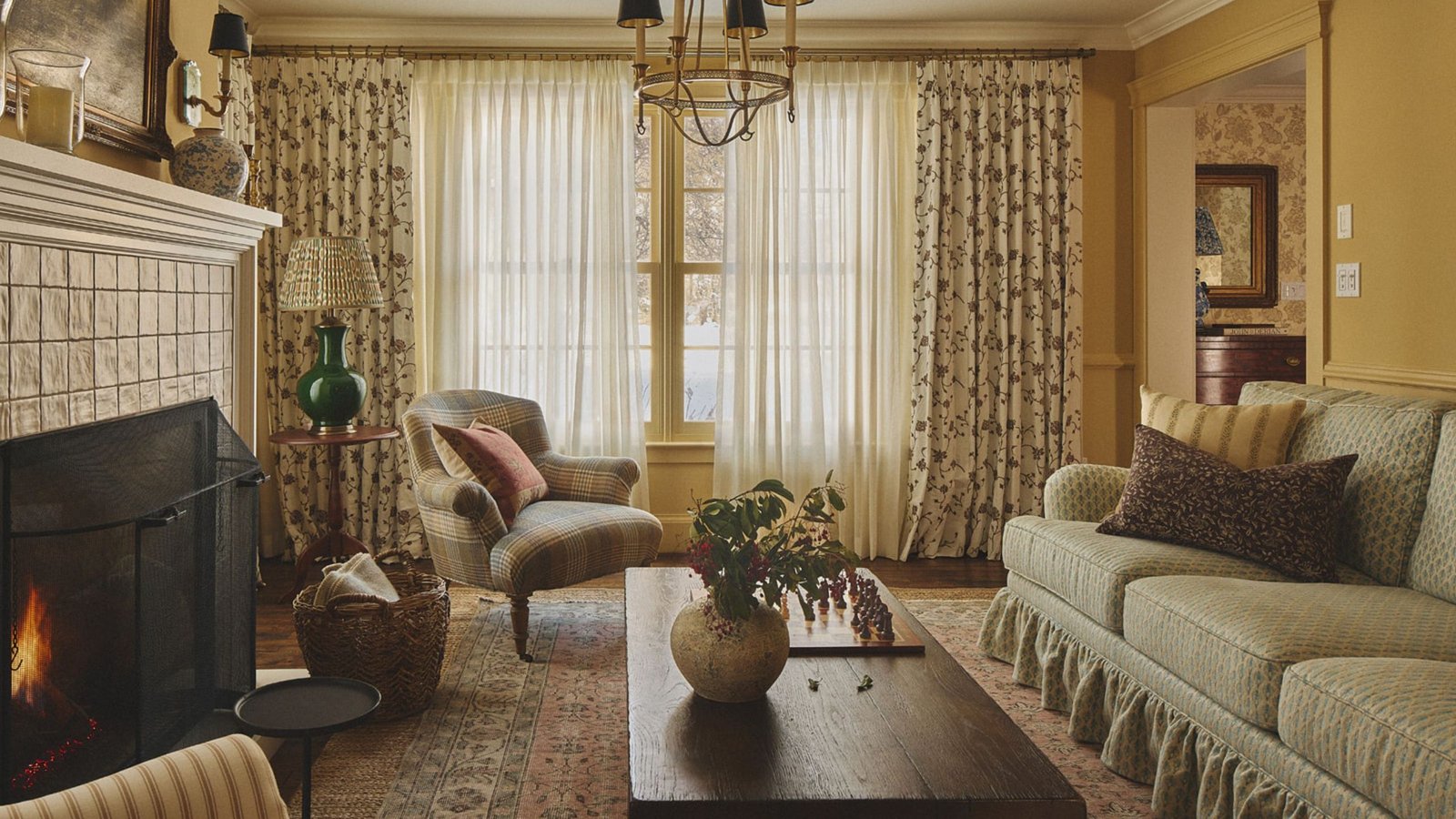
Living Room: A traditional fireplace, plaid armchair and ruffle-skirted sofa are layered with floral drapery, two rugs and antique accents to give the room its relaxed character. Walls, Farrow & Ball Hay; Rugs, Vintage; Custom Skirted Sofa, Whittington and Co.
(Image credit: Kate Crespi Interiors / Photography Will Reid)
The English influence here is unmistakable, but it isn’t about recreating a cliched country house halfway across the Atlantic. For Kate, it was more about finding the right foil to the traditional architecture already in place. The narrow-plank hardwood floors, wainscoting, and substantial millwork gave the home a strong foundation, while the English style brought in the softness, pattern, and lived-in character to make those details sing. ‘I took a trip to England for the first time back in 2023, and I believe it has completely influenced the way that I look at interiors,’ Kate explains. ‘All of these existing elements needed their counterpart, and that’s when all the inspiration drawn from English design became a match made in heaven for this project,’ she continues.
That meant florals alongside stripes, checks alongside plaids, ruffled upholstery alongside wicker, and antiques alongside custom pieces. The ingredients are traditional, but the mix keeps them from feeling too precious. Kate describes the overall aesthetic simply as ‘relaxed English,’ with the emphasis firmly on relaxed: this is a family home, after all.
The details are allowed to be playful, too, from the botanical prints and brass accents to the custom lampshades that appear throughout the house. ‘I cannot begin to tell you how many custom lampshades we did in this home; in every room, we added a patterned, pleated, or colored lampshade. Decorative lighting always comes with a simple white shade (which in certain rooms can be a nice visual break), but this gives such a good opportunity to add a little unexpected pop of pattern or color,’ she advises.

Kitchen: A relaxed Roman shade, striped counter stools and wicker pendants bring warmth and character to the hardworking family kitchen. Counter Stools, Client’s Own Reupholstered Striped Fabric; Pendants, Hudson Valley Lighting.
(Image credit: Kate Crespi Interiors / Photography Will Reid)
The kitchen was less about changing what was already there and more about adding the details that made it feel connected to the rest of the home. ‘In the kitchen, we added elements that tied it together just as it was meant to be,’ she says. The existing counter stools were reupholstered in a wide stripe, while a relaxed Roman shade was added to frame the large window, and wicker pendant lights bring texture above the island. ‘I envisioned this island styled as what a Saturday morning in this home could look like, and it is really just the cherry on top in this space,’ she adds.

Dinette: Existing wicker chairs were given a deep green-blue finish and paired with a custom pine table, checked window seat and antique rug for a relaxed family gathering space. Walls, Farrow & Ball Lime White; Hutch, Farrow & Ball Light Blue; Dining Chairs, Client’s Own Repainted in Farrow & Ball Douter; Table, The Emporium; Rug, Vintage.
(Image credit: Kate Crespi Interiors / Photography Will Reid)
Just off the kitchen, the eat-in kitchen area (or ‘dinette’) is the family’s workhorse, designed for everything from homework to post-sports-practice dinners. ‘This space is where the family gathers on their day-to-day,’ says Kate. She brought in a custom pine extending table from local artisan The Emporium, then gave the clients’ existing wicker chairs a new lease on life by spraying them ‘in this incredible deep jewel-toned green-blue by Farrow & Ball.’ A new checked cushion transforms the window seat, while the painted built-ins showcase the family’s cookbook collection and porcelain.

Living Room: A yellow color drench, floral ruffle-skirted sofa and reupholstered plaid armchairs give this cozy sitting room its relaxed English character. Armchairs, Client’s Own, Reupholstered in Wool Plaid and Ticking Stripe Fabrics.
(Image credit: Kate Crespi Interiors / Photography Will Reid)
Stepping into the living room, this is where Kate really lets the home’s English-inspired character shine. ‘The formal living room is like a snug off the foyer when you immediately enter the home,’ she explains. ‘This room just fills my cup every time I look at it.’ The yellow color drench, which runs from the wainscoting all the way to the ceiling, sets the warm tone, while the ruffle-skirted sofa and existing armchairs – reupholstered in wool plaid and ticking stripe – make the room feel inviting rather than overly formal. ‘The ruffle-skirted sofa (probably the best piece I’ve laid my eyes on) and the two armchairs flanking the fireplace are inviting and playful, yet sophisticated. This room is timeless through and through.’

Primary Bedroom: A floral wallpaper, butter-yellow trim and light blue upholstered bed create a layered, quietly playful retreat, finished with the client’s existing green velvet chair. Wallpaper, GP&J Baker; Trim, Benjamin Moore Sandy Brown; Headboard and Armchair, Client’s Own; Quilt, Pottery Barn; Nightstands, Farrier Home.
(Image credit: Kate Crespi Interiors / Photography Will Reid)
The primary bedroom is the room she says ‘best captures the spirit of the project’. The scheme began with a little indecision: the designer and her client had initially planned to use seamless grasscloth, but when Kate presented the GP&J Baker floral wallpaper, the client immediately went for it. ‘It’s unassuming from a distance, but the pop of red just catapulted this room to the next level’.
From there, the palette came together around the wallpaper’s soft red tones, with butter-yellow trim, a light blue upholstered bed, patterned drapery, and brass sconces. The client’s existing green velvet chair adds an unexpected hit of color. ‘It’s balanced in femininity, sophistication, and playfulness,’ she says. ‘All the layers feel harmonious and unforced.’

Son’s Bedroom (Left) & Daughter’s Bedroom (Right): Buttercream yellow and indigo checks bring a playful polish to the son’s room, while Farrow & Ball’s Dead Salmon, paisley and deep truffle velvet give his sister’s space a more grown-up feel. Son’s Bedroom Walls, Benjamin Moore Butter Cream; Bedding, Zara Home; Chair, Four Hands. Daughter’s Bedroom Furniture, Client’s Own.
(Image credit: Kate Crespi Interiors / Photography Will Reid)
In the kids’ bedrooms, the decorating becomes a little more playful, but Kate was careful to design both spaces with longevity in mind. In the son’s bedroom, buttery walls, checkered indigo drapery, and a large comfy chair create a room that feels youthful without tipping into childlike. In the daughter’s room, the approach is more colorful and feminine, with the walls drenched in Dead Salmon, an existing armchair recovered in blue-and-pink paisley, and a headboard re-covered in deep truffle-brown velvet. ‘We wanted this space to feel mature for the stage of life that she was in, being 13,’ Kate says. ‘I just know that this room will be a space for her to transition through her young adulthood.’

Powder Room (Left) & Son’s Bathroom (Right): Leafy green wallpaper, antique bird prints and layered window treatments bring pattern, color and personality to the home’s layered bathrooms.
(Image credit: Kate Crespi Interiors / Photography Will Reid)
Even the bathrooms get the full decorative treatment. The powder room adjacent to the kitchen is the bolder of the two, with leafy green wallpaper, matching painted trim, and antique bird prints sourced from a local market. ‘I love the mix of the punchy green wallpaper against the dusty floral blue lampshades,’ says Kate. In the client’s son’s bathroom, the approach is quieter but no less considered, with blue-painted trim and layered window treatments adding softness, personality, and ‘a layered moment,’ she adds.
Shop the Look
The cleverest thing about this project may be that, for all its color, pattern and detail, it never feels like a home that has been styled all at once. By reworking what they already owned, adding pieces with history, and allowing each room to have its own personality, Kate has created something that feels collected rather than constructed. ‘The goal was to create a home that feels lived in, layered, and timeless,’ she says – and that is exactly what this family home now feels like.
Love beautiful design ideas, expert advice, and inspiring decor trends? Sign up for our newsletter and get the latest features delivered straight to your inbox.