Field Notes From Our NYC Editor for July
I’ve spent much of the past couple of months on the road, which seems to happen every year despite the fact that summer is my favorite season in New York. Plenty of New Yorkers can’t wait to escape — it’s simply too hot, they’d rather be at the beach — and they certainly can’t resist talking about the weather. Perhaps that’s why several of the things that caught my eye this month involved heating and cooling systems.
That became something of a theme for this column. Time and again, it was the seemingly mundane objects that seemed most fascinating: basic white kitchen bowls, ergonomic office chairs, even a radiator cover. But seen through a design lens, these everyday objects become anything but ordinary.
The most interesting design news isn’t always what you’d expect, and that’s exactly what held my attention this month. Here’s what’s been on my mind for this month’s Design Diary.
EXHIBIT A — Park Avenue Armory

(Image credit: © Céleste Boursier – Mougenot/ADAGP | Photo: Nicholas Knight)
I can’t not talk about the bowls. Currently swirling around three pools at the Park Avenue Armory are hundreds of white porcelain bowls, sourced from the likes of IKEA and ASA Selection. They are part of Clinamen, an exhibition by French sound artist Céleste Boursier-Mougenot, and my top recommendation this summer (though the program runs through August 2).
Within each bright blue pool, the water circulates hundreds of these basic kitchen bowls. While they all exist in the same current, they scatter in seemingly aimless directions before clinking and clunking into one another, the sounds echoing throughout the cavernous space. The loose idea is to challenge the very notion of composed music through chance and discordant sound — and, satisfyingly, the result is an almost meditative soundtrack.
There are plenty of interpretations here that I’ll leave to the art critics. But for those of us in the interiors world, it’s a delight to see an artist reaching into the kitchen cabinet for their medium. It’s a reminder that even the most ordinary domestic object can become something unexpectedly extraordinary.
COLLAB WATCH — THUMA x BUCHANAN STUDIO

Image credit: Thuma

Image credit: Thuma
I’m an unapologetic fan of color and pattern, and I’ll admit that neutrals — or minimalism in general — are concepts I appreciate from a distance. And so I was excited to see that Thuma, a mostly minimalist furniture company, has gone in a colorful new direction for their collaboration with London’s maximalist-minded Buchanan Studio.
Latest Videos FromLivingetc
The collection, their first-ever collaboration, is a series of beds and pillows dressed in Buchanan’s signature graphic stripes and a soft palette of pinks, greens, and browns. It might not be radical for most brands. But for Thuma, a brand that’s remained faithful to a restrained palette (neutrals, wood, and solids) since launching in 2018, it’s a colorful foray.
I don’t think we’re going to see leopard print from Thuma anytime soon. But the bold stripes and soft colors are well-behaved enough to feel at home within Thuma’s minimalist aesthetic, and it’s a reminder that minimalism can still be expressed with a little color and pattern.
DESIGN DROP — AERON CHAIR

Image credit: Herman Miller

Image credit: Herman Miller
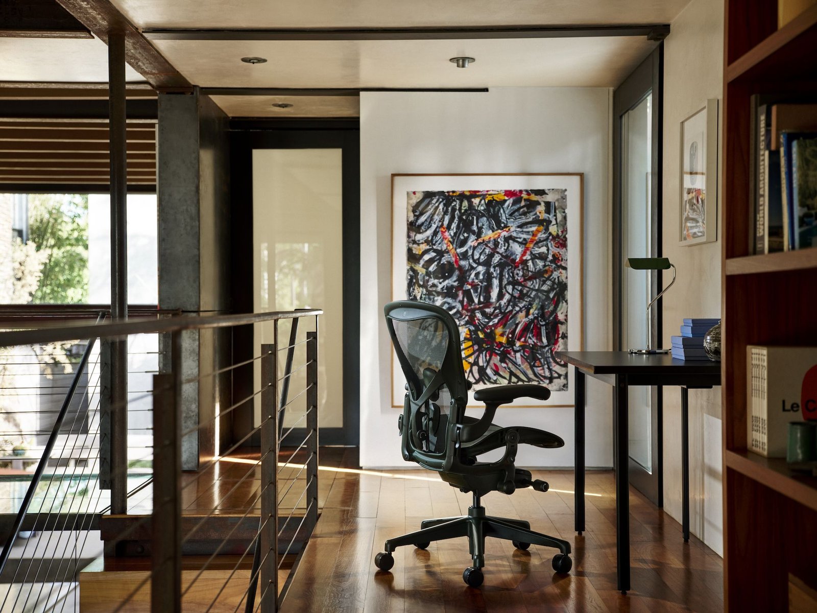
The news at a recent gathering inside Herman Miller’s New York headquarters was the debut of two new colorways for the iconic Aeron chair. But the story I found most intriguing was actually rather old news. As we spoke about the chair’s evolution, we stumbled onto the year 2001, when the Aeron chair was collateral damage of the Enron scandal; after images circulated of employees wheeling their black office chairs out of the bankrupt building, the iconic chair was swept up in chaos as all things Enron became symbols of corporate excess.
Herman Miller quietly put planned developments for the chair on pause as they waited out the storm. Years later, the company brought the chair back into the limelight, and associations with the scandal are now mostly forgotten. It’s a reminder that all press isn’t great press — we’re lucky the chair outmaneuvered the situation, especially since it’s become one of the more beloved pieces of American-made office furniture around (not to mention one that has redefined ergonomic seating, like being the first to use mesh suspension).
Back to the reason we all gathered in the first place: new colors, their first in a decade. They include Jasper, a deep green, and Nightfall, a deeper blue, two colors that blur the line between corporate and home office aesthetics. They’re not the types of colors we would have seen in most corporate offices decades ago, even many today. But for an innocent office chair that once risked being lost to history, the future is looking considerably more colorful.

Herman Miller
Aeron Chair in Nightfall
Slipping a bit easier into work-from-home aesthetics, the new Nightfall color for Herman Miller’s iconic Aeron Chair brings a subtle blue to the office chair that reads a bit more natural—and casual—than the classic black palette.
STYLE NOTE — Makrosha

Image credit: Chris Mottalini

Image credit: Chris Mottalini

Image credit: Chris Mottalini
Quite the reverse is happening over at the refashioned showroom for textile designer Makrosha, which is dipping into solids for the first time. But just a toe: founder Esha Ahmed hasn’t abandoned the florals and richly patterned textiles that have made the studio a rising favorite among designers.
Ahmed worked with interior designer Tara McCauley, whose work is deeply informed by antiques and heritage craft, to reimagine the interiors. There’s plenty to adore in the new space: an entry draped like a tent in the brand’s Meena silk stripe, and a shimmering silver wallpaper that helps bounce light around the sample room.
But my favorite detail is one I almost missed. To level up an unsightly radiator, McCauley and Ahmed collaborated with Maria Laura Camejo, founder of Mexico City’s Concordia Studio, on perforated panels that evoke lace. It’s a delicate touch for a hardworking feature, not to mention a clever nod to the world of textiles. There are plenty of ways to make a radiator look good, but even still, it’s not often that my eye wanders to the HVAC — and even less often that I find something worth looking at!
ON MY RADAR — QUILT

Image credit: Quilt

Image credit: Quilt
I’m not built for the heat. Which is why, at a candlelit dinner hosted by the Brownstone Boys — who’ve just opened their first studio in a carriage house in Clinton Hill — I found myself drawn, once again, to the HVAC system. The garage door stood completely open to the warm evening air, and a dramatically long table (two expandable Transformer Table units at twelve feet each, to be exact) stretched through the center of the studio. As I walked in, I immediately started wondering how they planned to keep upwards of 40 dinner guests comfortable.
The answer came in the form of two ductless units by Quilt mounted high on the brick walls. With warm wooden fronts, they were surprisingly slim and beautiful — and remarkably effective. Even with the doors open all evening, the studio stayed cool all evening.
The brand, built by ex-Google engineers, is fully electric, and the idea brings both efficiency and aesthetics to one of the least glamorous systems in the home. The wooden covers are interchangeable (the Brownstone Boys planned to let guests graffiti them at an upcoming stoop sale), and an integrated light gives the units a second function. I left full, and with a newfound appreciation for air conditioning.

transformertable
Transformer Table
It’s almost comical how large and small this collapsible table can be — from 18 to 118 inches, to be exact. This makes it a rather clever item to have on hand if you’re prone to entertaining crowds, especially in city apartments where you don’t want a massive table hogging up all the floorspace when it isn’t in use.

At the new Clinton Hill studio of Brownstone Boys, a recent summer dinner was successfully cooled by two discreet ductless HVAC units designed by Quilt.
(Image credit: Ethan O’Grady for Brownstone Boys)