
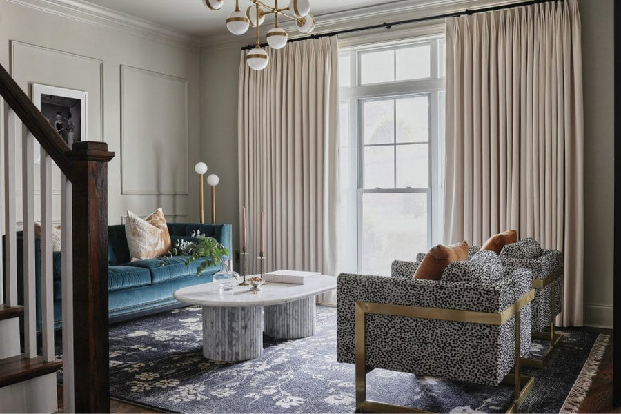
Immerse yourself in the enchanting world of color, where every hue tells a story. The social heart of your home calls for a palette that reflects your personality and elevates your lifestyle. Here’s a selection of living room paint colors that appear repeatedly in designer projects, and each behaves differently depending on light and room size.
Tips for Choosing the Ideal Color for Your Living Room

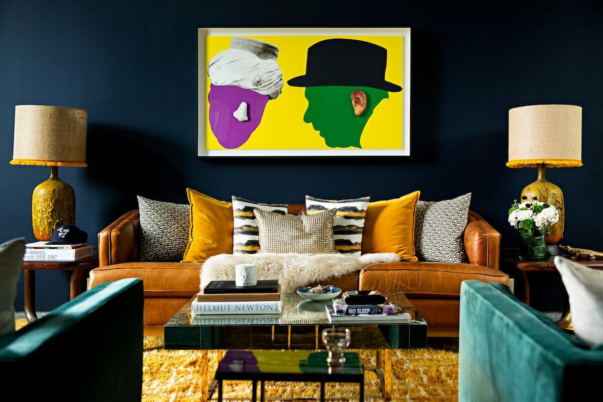
Paint is the cheapest variable in a living room design and the slowest to settle. Most shortlists come down to a dozen shades that look similar on a two-inch chip, which gives homeowners a headache. The tips below cover how living room paint colors behave once they are part of the layout.
- Consider Your Room’s Purpose: How do you want to use your living room? When considering color psychology, decide what kind of energy you’d like to inject into your space. For a serene feel, go with lighter shades; for more lively gatherings, select a bold palette.
- Assess Natural Lighting: Determine how much natural light your living room layout receives, and pick your living room color schemes accordingly.
- Contemplate Your Room Size: In general, the size of your living room influences color selection. But a vibrant scheme in small room can also convey an atmosphere of a designer home.
Unsure which living room colors match your interior’s look? Then try our Free Interior Design Style Quiz to find your true style!
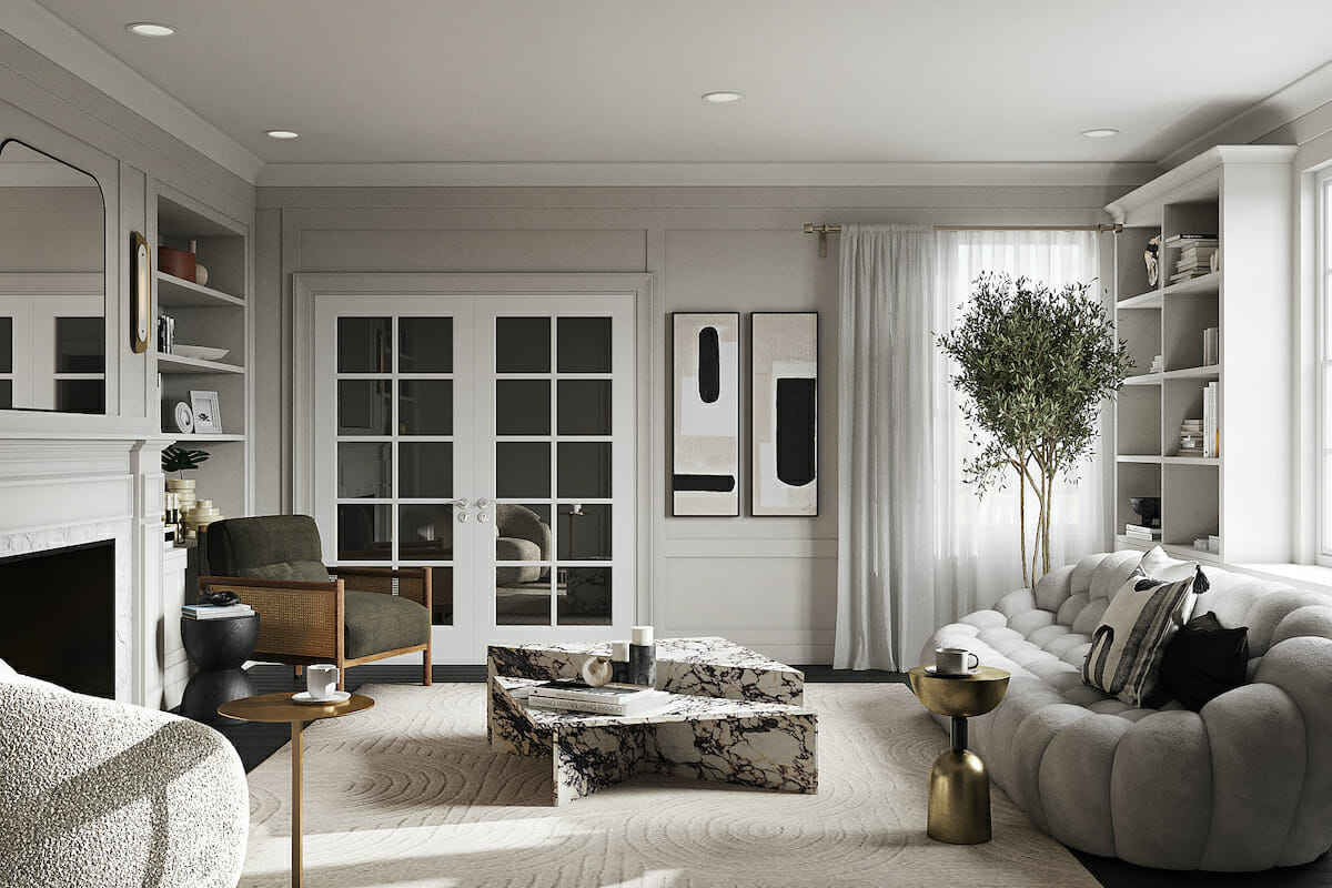
- Blend In With Existing Décor: Take into consideration your existing furniture, architectural elements, and anything you wish to keep in the layout. The ideal color for a living room complements and contrasts with the above.
- Study Different Lighting Conditions: Test your best living room paint colors in different lighting scenarios. Every color looks different in various lighting conditions.
8 Best Living Room Colors

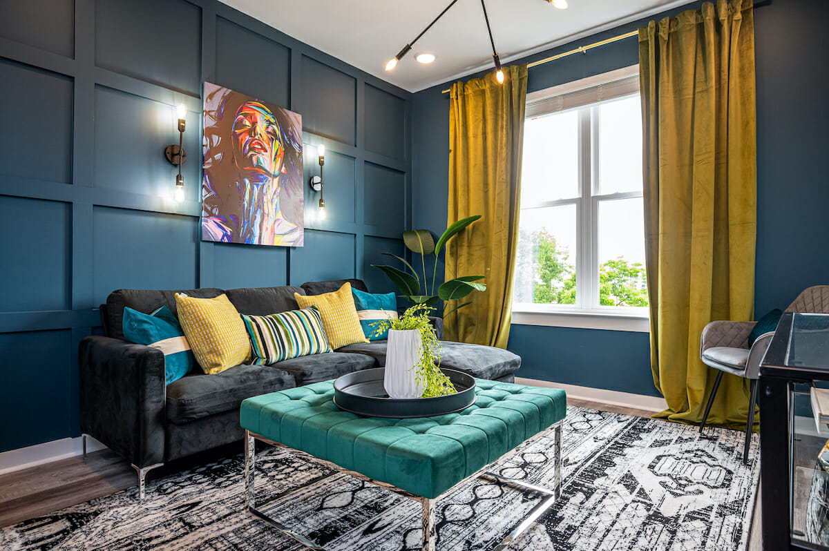
Choosing the best color for your living room walls sets the foundation for your aesthetic. To help you select, we have created a list of popular living paint room colors that convey distinct moods.
1. Tranquil Blue

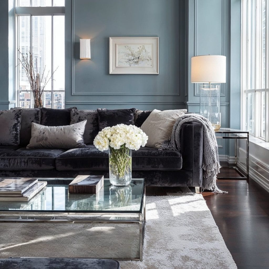
Blue holds its color at low light levels, which is why it works in rooms used after dark. The soft end of the range carries a gray or green cast that keeps it clear of nursery brightness. Against warm wood the effect is cooling, so a walnut floor or rattan chair gives the color something to push against.
Paint Colors to Consider:

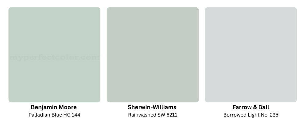
- Benjamin Moore Palladian Blue HC-144: A soft blue-green that stays calm in strong daylight.
- Sherwin-Williams Rainwashed SW 6211: A green-blue over a gray base, deeper than it reads on the chip.
- Farrow & Ball Borrowed Light No. 235: The palest blue in the range, suited to north-facing rooms.
2. Light Gray
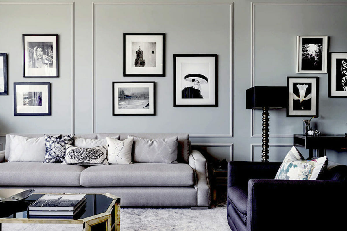
Light gray sits close enough to neutral to recede behind furniture, which makes it forgiving in an open living room layout. The undertone surfaces at scale, and it’s usually green or violet. Sample it on the wall facing away from the window, where the color goes coldest. Warm metals and oak bring it back toward neutral.
Paint Colors to Consider:
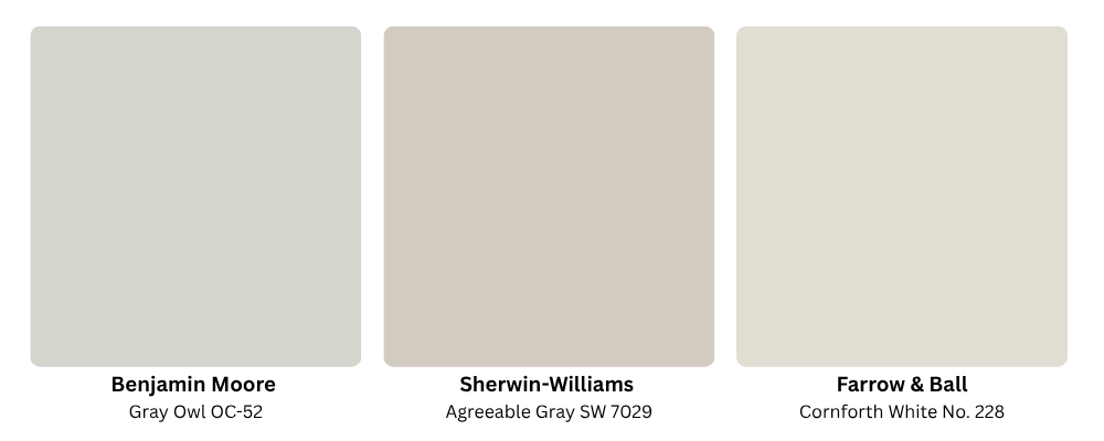
- Benjamin Moore Gray Owl OC-52: A light gray that shifts green in some light.
- Sherwin-Williams Agreeable Gray SW 7029: A warm greige that holds its balance in sunny rooms.
- Farrow & Ball Cornforth White No. 228: A mid-weight gray with enough depth to read as a color.
3. Classic White

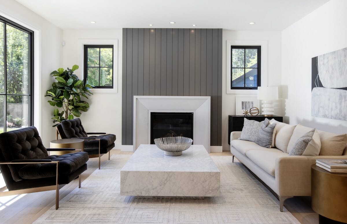
The crisp white color covers a wide range, and the spread from coolest to warmest changes the room. A clean white holds edges crisp and shows every shadow line in millwork, while creamier whites take the glare off a south-facing room at midday. Sheen counts too: flat absorbs light; eggshell throws it back.
Paint Colors to Consider:
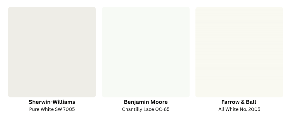
- Sherwin-Williams Pure White SW 7005: A soft white that avoids a clinical finish.
- Benjamin Moore Chantilly Lace OC-65: The crispest white on this list, clean and untinted.
- Farrow & Ball All White No. 2005: White with no added pigment, so it takes on surrounding light.
4. Soft Beige

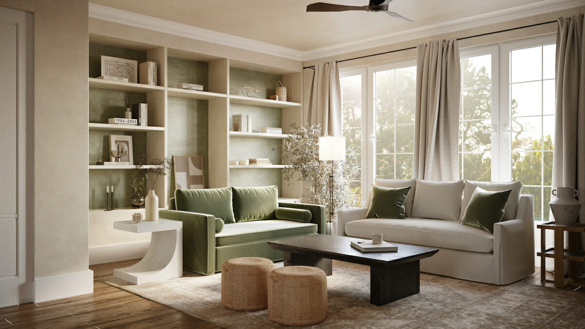
Wood grain and textile color sit better against a warm neutral than against gray. One thing you likely don’t want here is yellowing in afternoon light, which the pink-leaning versions resist. Moreover, two beiges a few steps apart, one on the wall and one on trim, add depth even to a flat elevation. These are only a few reasons beige remains among the most used living room paint colors regardless of how much the trends change.
Paint Colors to Consider:
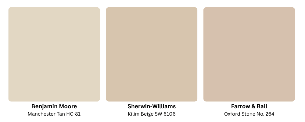
- Benjamin Moore Manchester Tan HC-81: A light tan that stays neutral against wood floors.
- Sherwin-Williams Kilim Beige SW 6106: A golden beige with a soft pink-tan undertone.
- Farrow & Ball Oxford Stone No. 264: A grounded stone beige with visible warmth.
5. Invigorating Green

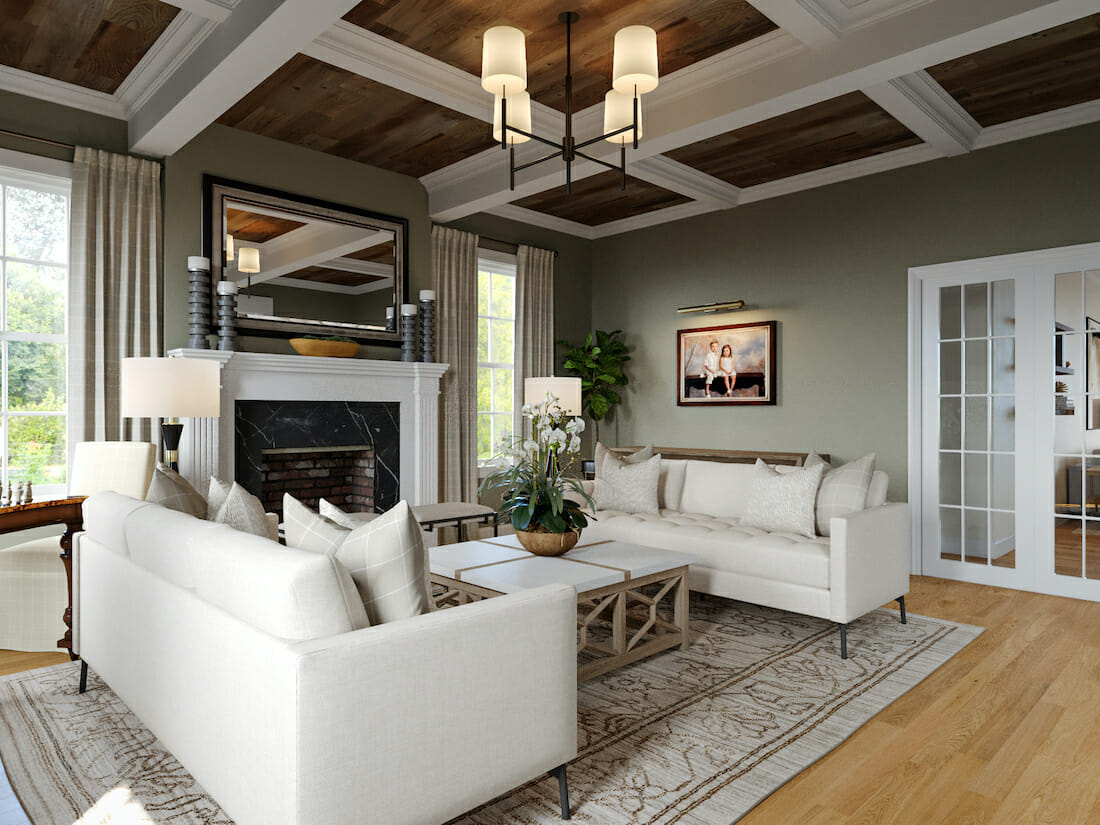
Green behaves like a neutral once there are plants and wood in the room, yet on a bare wall it reads as full color. The muted sages sit between gray and olive depending on the hour. Deeper greens, meanwhile, want brass hardware and a room with real daylight, since they lose depth under bulbs alone.
Paint Colors to Consider:
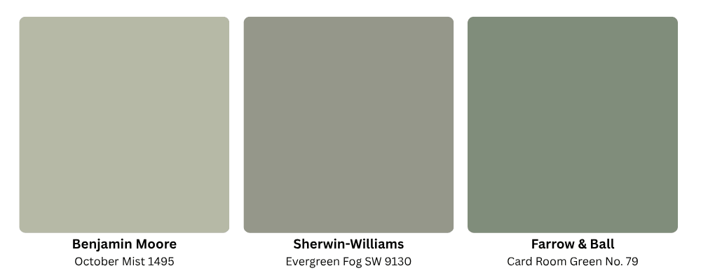
- Benjamin Moore October Mist 1495: A muted sage that works as a quiet backdrop.
- Sherwin-Williams Evergreen Fog SW 9130: A green-gray with enough body for a full room.
- Farrow & Ball Card Room Green No. 79: A deep green for rooms that can carry saturation.
6. Decadent Chocolate

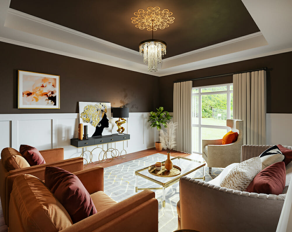
Chocolate brings the wall down to the weight of the floor, so the furniture set against it gives up its outline. Whatever still catches light inherits the job of structure, which is why brass and glazed ceramic earn their place here. In the end, a lot depends on lamps at seated height. A single ceiling fixture illuminates the middle of a dark living room but abandons the corners, and that is hardly the version of the “moody” look you are after.
Paint Colors to Consider:
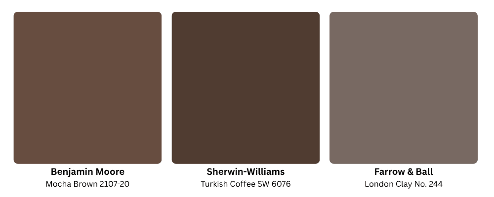
- Benjamin Moore Mocha Brown 2107-20: A deep brown with a warm red undertone.
- Sherwin-Williams Turkish Coffee SW 6076: A near-black brown that reads rich under lamplight.
- Farrow & Ball London Clay No. 244: An earthy brown that leans terracotta in warm light.
7. Moody Charcoal
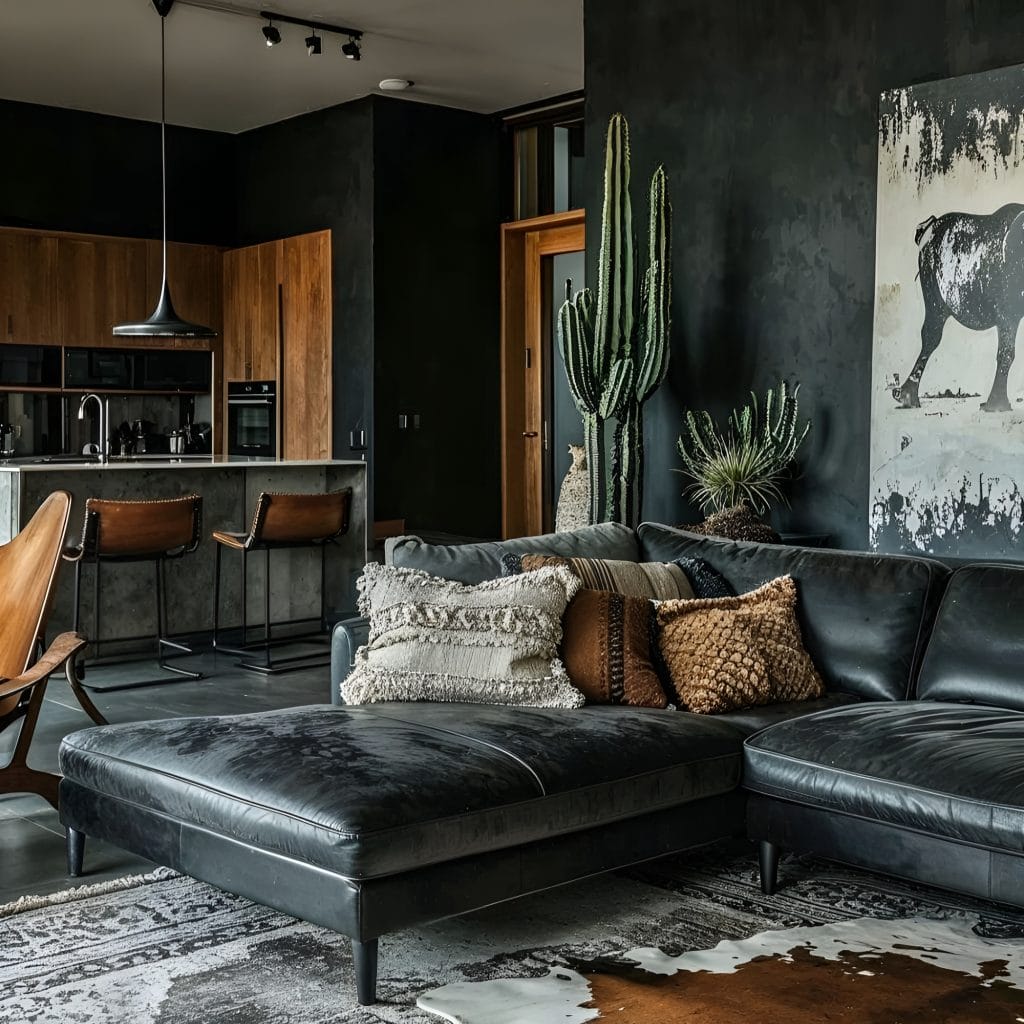
Charcoal sits at the deep end of the living room paint colors range and gets chosen when the room needs a statement, mainly due to its dark and mysterious allure. The undertone is the whole decision here. Blue-leaning charcoals feel cool and crisp against white trim, the brown-leaning ones sit closer to a deep taupe and warm considerably at night. There is also a green-gray version that goes almost slate in daylight. Among dark colors charcoal is the most adaptable, since it takes both warm and cool metals without a fight.
Paint Colors to Consider:
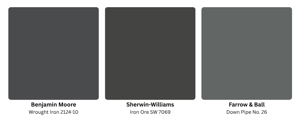
- Benjamin Moore Wrought Iron 2124-10: A charcoal deep enough to function as a black.
- Sherwin-Williams Iron Ore SW 7069: A soft black-charcoal, the most used dark neutral in the range.
- Farrow & Ball Down Pipe No. 26: A blue-leaning charcoal that leans cool.
8. Dark Teal
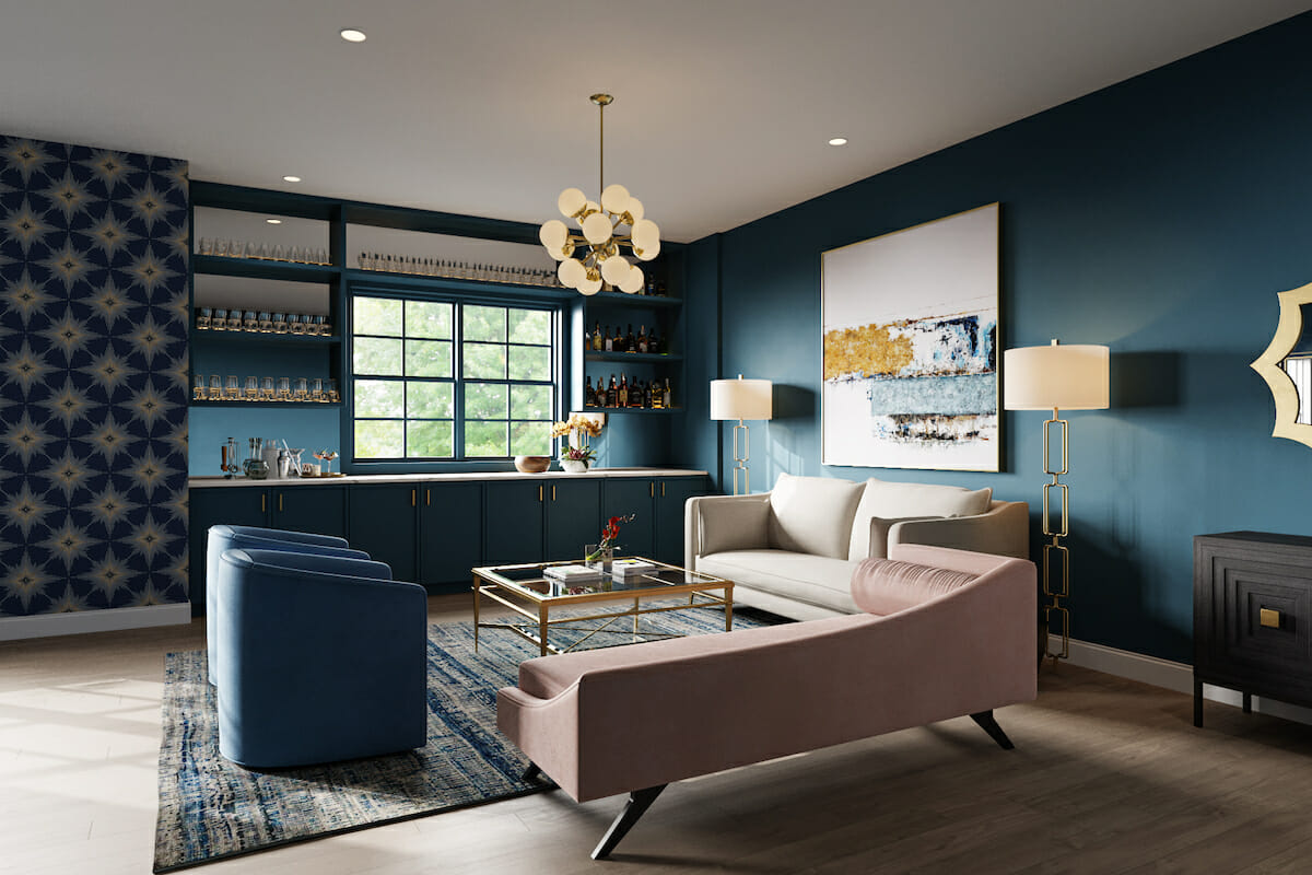
Teal holds blue and green in the same shade, and the balance between them moves with the light. Morning brings the green forward, while late afternoon settles the same wall toward blue and several steps deeper. The blue-heavy versions edge toward navy, the green-heavy end goes almost forest and picks up whatever timber is in the room. Gray softens both. Most palettes built on teal run well alongside warm neutrals, since oak and unbleached linen take the edge off the depth.
Paint Colors to Consider:
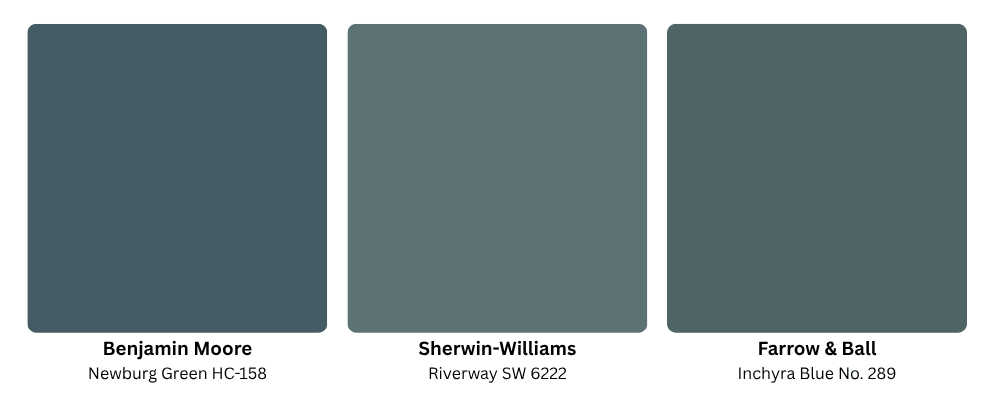
- Benjamin Moore Newburg Green HC-158: A deep teal-green with a traditional register.
- Sherwin-Williams Riverway SW 6222: A gray-tempered teal that suits large wall areas.
- Farrow & Ball Inchyra Blue No. 289: A dark blue-green that shifts with the light through the day.
Frequently Asked Questions
No single shade wins, though soft neutrals cover the widest range of rooms. Beige and light gray recede behind furniture and tolerate a change of decor years later. Rooms with strong daylight and a settled furniture plan carry deeper choices well. Teal and charcoal both hold up in that situation.
Shades with high light reflectance push the walls back. Sherwin-Williams Pure White sits at an LRV of 84, and Farrow & Ball All White reaches 90, near the top of the scale. Running the same color onto trim and ceiling removes the visual break where the wall stops, which in return reads as more height.
North light stays cool and even through the day, which drains warmth from whatever is on the wall. Warm neutrals survive it best: a beige with a pink-tan base, or a greige that leans warm. Blues and grays go colder in these rooms and deepen by late afternoon.
Three is the working standard, distributed on the 60-30-10 split. The dominant color takes the walls, a secondary color goes to the large upholstery, and the remaining tenth covers accents. Since wall color claims the largest share, it should be the least saturated of the three.
Need some help selecting the best living room colors for your home?
Narrowing the choices down is easier with a designer reading the room’s light alongside you. Schedule a Free Interior Design Consultation to talk it through today!