Designers’ Favorite Farrow & Ball Blue Paints for Kitchens
As we bid adieu to the white kitchens of the 2000s and grow tired of the green ones plastered across our social media feeds for the last decade, we’re all on the hunt for the next go-to shade. Well, blue might be the front-runner. Calming yet energizing, blue is a color of contradictions, containing a multitude of qualities across its varying hues and tones. The exact shade you choose can completely transform the feel of your space, and with over 50 different paint shades to choose from, Farrow & Ball has an option for every setting.
The thing is, a blue kitchen is never as simple as it first sounds. It’s an overarching term, encapsulating a wide net of styles and finishes. It could refer to a bright sky blue, an icy pale shade, or a moody, inky one. You could opt for a striking Yves Klein blue, a dusty, muted teal, a jewel-toned sapphire, or an enchanting turquoise. There are endless varieties, offering unique effects, which can make picking the right one feel rather intimidating. So, to help you narrow it down, I’ve asked interior designers for their top Farrow & Ball blues for kitchens, specifically.
A favorite of designers and homeowners alike, there’s a reason Farrow & Ball is one of the most recognizable paint brands in the UK, and its collection of blue paints is a perfect testament to what makes it so special. But instead of leaving you with 56 different shades to thumb through, our experts narrowed it down to just three.
Latest Videos FromLivingetc
1. Kittiwake by Farrow & Ball

“It seems to strike the perfect balance between feeling fresh and timeless. It brings a sense of lightness and personality to the kitchen,” explains Maureen.
(Image credit: Juliet Murphy. Design: Maureen Gomez, King Cabinet Makers)
The first time I saw this shade used in a kitchen, I immediately had to know exactly what paint color it was. Farrow & Ball’s Kittiwake isn’t one of its most well-known shades, but it should be. There’s such a beautiful clarity to this sky blue shade, like a true breath of fresh air. It’s crisp and refreshing, while a subtle touch of black pigment keeps it from feeling too bright.
It’s the kind of color you could never tire of, and would work beautifully in practically any room. “I had used Kittiwake in a bedroom a few years ago and loved it,” shares designer Maureen Gomez. It wasn’t until her clients specifically requested a blue kitchen that it occurred to her how well Kittiwake would work in this setting.
“Kittiwake creates a calm, uplifting atmosphere that works beautifully in a kitchen, particularly one with plenty of natural light,” she adds, and in this home, with a large skylight in the kitchen and plenty of natural light flowing, this felt particularly significant. But, even in darker, north-facing kitchens, Kittiwake can still be a good choice. “Unlike some cooler blues, it doesn’t feel clinical,” notes Maureen.
In terms of styling, Kittiwake pairs beautifully with natural materials, warm tones, and textured finishes, with Maureen listing: “Warm timber, aged brass, natural stone or terracotta, and off-whites” specifically.

A sophisticated true blue, Kittiwake is a bright, clean sky blue.
Maureen Gomez
Using her background in fine art and design, Maureen specializes in restoring period properties, bringing modern touches and antique finds together to create a style that feels truly timeless and unique to each home.
2. De Nimes by Farrow & Ball

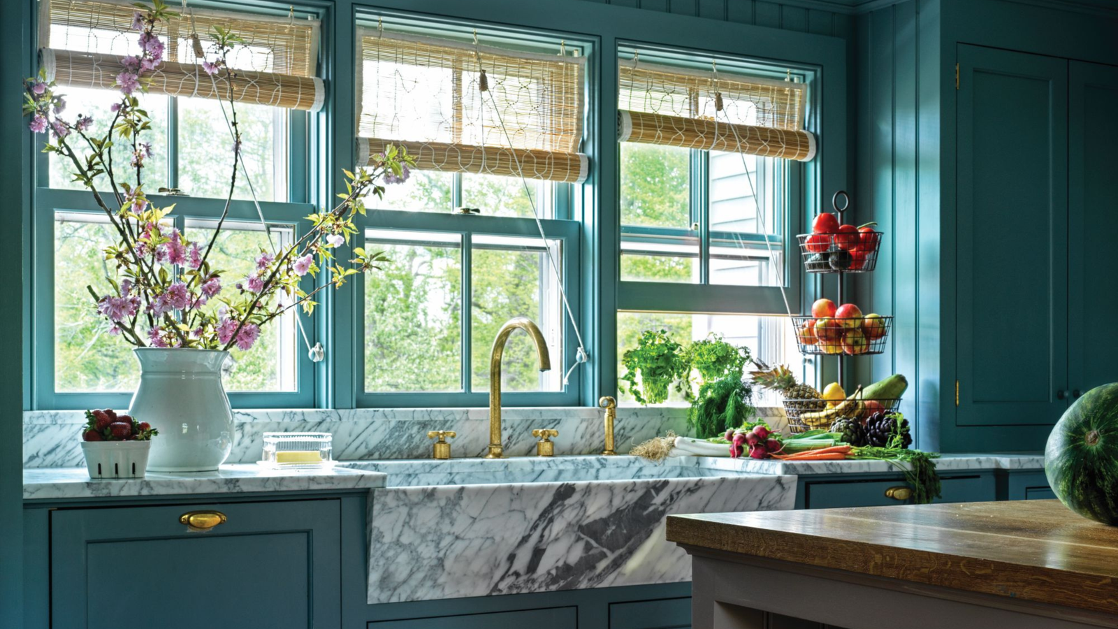
De Nimes pairs beautifully with natural materials, like this marble sink and wooden flooring.
(Image credit: Chris Mottalini. Design: Hendricks Churchill)
One of the better-known shades amongst Farrow & Ball’s blue paints, De Nimes is a sophisticated, understated blue, with a subtly smoky hue. Comparable to denim, this is perhaps the most neutral a blue can get and, as such, is remarkably easy to use in the home.
This neutrality is exactly what appealed to Heide Hendricks, from Hendricks Churchill. In search of a good white kitchen alternative, Heide landed on this gentle blue. “We wanted to avoid a white kitchen to prevent the space from feeling sterile or lacking coziness. We looked for a saturated color that could still recede and avoid overwhelming the room with too dramatic an effect,” she explains, “De Nimes ticked all of those boxes perfectly.”
What makes this Farrow & Ball blue kitchen paint color so unique is its ability to appear so understated and subtle, while still being a relatively strong color. Looking at it in the tin, you perhaps wouldn’t think of this deep bluey-gray as a neutral kitchen color. But once it’s used across the walls or kitchen cabinets, it immediately makes sense. “Even though it is a saturated color, it serves as a neutral backdrop due to its calming mood,” Heide adds.

A supremely sophisticated shade, De Nimes is the grayest of Farrow & Ball’s blue paints, making it a great neutral option.
3. Oval Room Blue by Farrow & Ball

When paired with darker counters, this blue Farrow & Ball paint feels bright and refreshing in comparison.
(Image credit: Boz Gavoski. Design: Maddalena Minerva)
Out of all of Farrow & Ball’s blue paints for kitchens, Oval Room Blue is described as the most ‘blackened’, with a strong gray undertone. While this may sound heavy or intense, somehow, it instead translates as something deeply comforting.
Instead of heaviness, these black pigments bring a depth to the shade. It was this sense of depth that made the shade stand out to designer Maddy Minerva. “We wanted a blue that felt timeless, while adding depth and character to the space,” she shares.
Named after the sitting rooms of the late 18th century, there’s a historic quality to this shade, which works particularly well in rustic, farmhouse kitchens or alongside more traditional kitchen features. Despite this historic aspect, the shade still feels timeless, Maddy says.
While describing a blue shade as warm may seem slightly oxymoronic, in the case of Oval Room Blue, there is a genuine legitimacy to the claim. It feels far cozier than you’d expect from a gray-toned blue, shifting with the light to feel even more inviting. “Oval Room Blue changes beautifully throughout the day,” explains Maddy.
This shifting tonality and naturally calming nature is exactly what makes it such a good fit for kitchens. “It adds warmth and depth to what is often a very practical room, creating a calm, inviting atmosphere,” says Maddy.
It’s also remarkably easy to style, and “pairs effortlessly with natural materials like timber, stone, and brass,” says Maddy. Because it’s such an adaptable color, with a darker kitchen worktop, the shade will appear brighter in comparison, while it could equally be used to add depth to a brighter, marble kitchen.

Farrow & Ball
Oval Room Blue
Described as a ‘blackened historic shade’, Oval Room Blue is cozy but elegant, providing a calming atmosphere to any room.
Maddy Minerva
With years of experience at some of London’s top design firms, and a degree from Central Saint Martins, opening her own studio was a natural next step for Maddy. Since 2022, she had worked on countless residential and boutique commercial projects, collaborating closely with her clients to create spaces that feel uniquely personal.
Not fully sold on a blue kitchen? Luckily, there are plenty more Farrow & Ball kitchen colors for you to choose from, ranging from neutral to bold, with a little something for everyone.
For more ideas and inspiration, sign up to our newsletter.
TOPICS