A House Where Neutrals Pack as Much Punch as Jewel Tones
Pale and interesting. A neutral palette. Tonally tight. But not at all pared back. These were the qualities that jumped out to the Livingetc Style Awards judges when they saw this house in the entries for House of the Year, and why they shortlisted it.
Designed by Manchester-based studio TXTURED, this four-storey Georgian townhouse in north London may be designed around a limited number of colors, yet the decor still has a lot of detail — texture, movement, shapes that seem to ripple as the light and shadow move over them.
“The owners wanted me to create something for them that was very clean, very chic; they love neutrals,” says Simon Mayhew, studio founder. “Personally, I’m very into transitional design — mixing older and newer pieces as one — so we leaned into that. The result is something that feels quite Californian — all the inspiration shots the clients pulled were of Cali beach houses — yet not out of place for its British setting.”
Latest Videos FromLivingetc
A testament to Simon’s work is the fact that these images were taken on a cold, dark, gloomy December day, yet they’re still somehow filled with lovely, dappled light. Here, in his own words, Simon explains how he did it.
Entryway

Marble flooring, Artisans of Devizes. Console, Restoration Hardware.
(Image credit: Vigo Jansons. Design: TXTURED)
“As soon as you walk into the home, and into this entryway, you get a feeling of pure joy,” Simon says. “It’s so pretty and calming, and not what you expect from the grand facade outside.”
The marble flooring is made up of blush pink and soft brown stone. “We felt it would be so much less harsh than a classic black-and-white scheme would have been,” Simon says.
Living Room

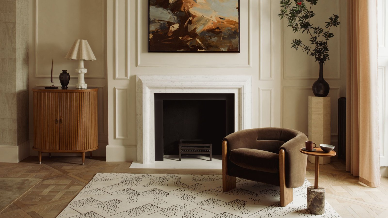
Display unit, Coach House. Chandelier, West Elm. Rug, The Rug Company. Armchair, Soho Home.
(Image credit: Vigo Jansons. Design: TXTURED)
The living room is an L-shape, allowing Simon to use one portion as the main entertaining area and the other for the comfy sofa and to squirrel the TV.
“The first piece I found for the whole project was this rug, which I chose because the clients love skiing and it looks like little mountain ranges,” he shares. “I was so relieved when I showed it to them, and they loved it, as by that point I’d built the whole scheme around it.”
Notice the arched shape of the cabinet, a theme that will appear again elsewhere. “I’m obsessed with arches,” Simon says. “There is at least one on every floor, though I was careful not to overdo it. I think they’re so welcoming and soft.”

West Elm
Florent Chandelier

Soho Home
Winnie Armchair in Chocolate Velvet

Anthropologie
Fern Ash Wood Storage Cabinet
TV Area

Sofa and Coffee table, both Restoration Hardware. Rug, Nordic Knots. Chandelier, West Elm.
(Image credit: Vigo Jansons. Design: TXTURED)
One of Simon’s favorite details is the art by Tom Benson used around the home, commissioned by Simon at a later stage of the design process.
“Once we had the textiles chosen, I gave him samples, and he was able to work up pieces that matched and complemented our colors exactly,” he shares. “The TV area is a really good example of how he was able to match exactly the tones used elsewhere.”
Dining Area

Dining table, Atelier 278. Dining chairs, Six the Residence. Sideboard, Coach House. Lamp, lightsandlamps.
(Image credit: Vigo Jansons. Design: TXTURED)
“The dining area was one of the trickiest parts for me,” Simon says. “It’s open plan to the kitchen, and the owners had inherited a new, shiny white kitchen with the house that they didn’t want to change. So I had to find something that wasn’t jarring.”
He chose a pale stone to match the white of the kitchen. “And then I’m really into fluting, so the texture of the cabinets helped to tone everything down a few notches,” he adds.
If you look closely at the cabinets under the bar, you’ll notice that the size of each ridge isn’t quite even. “That was intentional,” Simon says. “Making them so they weren’t evenly spaced allowed for a more interesting relationship with the light.”
Powder Room

Wall lights, Visual Comfort. Tap, Lusso.
(Image credit: Vigo Jansons. Design: TXTURED)
Limewash is a feature throughout much of the home, but only in this powder room is it splashed in such a deep red hue. “I love the movement that limewash helps create, the depth and the texture it brings,” Simon says. “I felt like we had to go darker in this smaller space — it’s a myth that dark colors make tiny rooms seem little. Embrace their size and go deep on the pigment.”
The limewash used here has quartz sand in it. “It’s nicely rough to the touch,” Simon says. “You get a lot more texture, which I wanted for the room to feel more dramatic.”

Visual Comfort
Melange LED Elongated Sconce Wall Light
Main Bedroom

Table lamp, Zara Home. Headboard fabric, Mark Alexander.
(Image credit: Vigo Jansons. Design: TXTURED)
Of his decision to extend the headboard all the way across the wall behind the bed, Simon says it was mostly because he just adored that fabric and wanted to use more of it.
“I fell in love with the subtle checkerboard of the fabric, and wanted to blend it seamlessly into the wall,” he says. “I really felt this space had to be very calm and with clean lines only, and with no edge of the headboard halfway along the wall, it was one less piece of visual noise.”
The adjoining dressing room isn’t just closet space — the back doors actually hide the main bathroom. “It looks like you have a lot of wardrobes, but two of the doors conceal the bathroom,” he says. “It meant the transition flowed a bit more.”
Simon has done a very clever job of designing within the lines — of setting himself tight parameters when it comes to color, and then not letting them hold him back. He has found ways to play with texture and shape that elevate the scheme, adding in details to keep each corner as Californian-inspired as possible.
It was easy to place this squarely on the shortlist for House of the Year, a masterclass in making a muted scheme as fascinating as it can be.
See the House of the Year and other homes on the shortlist here.